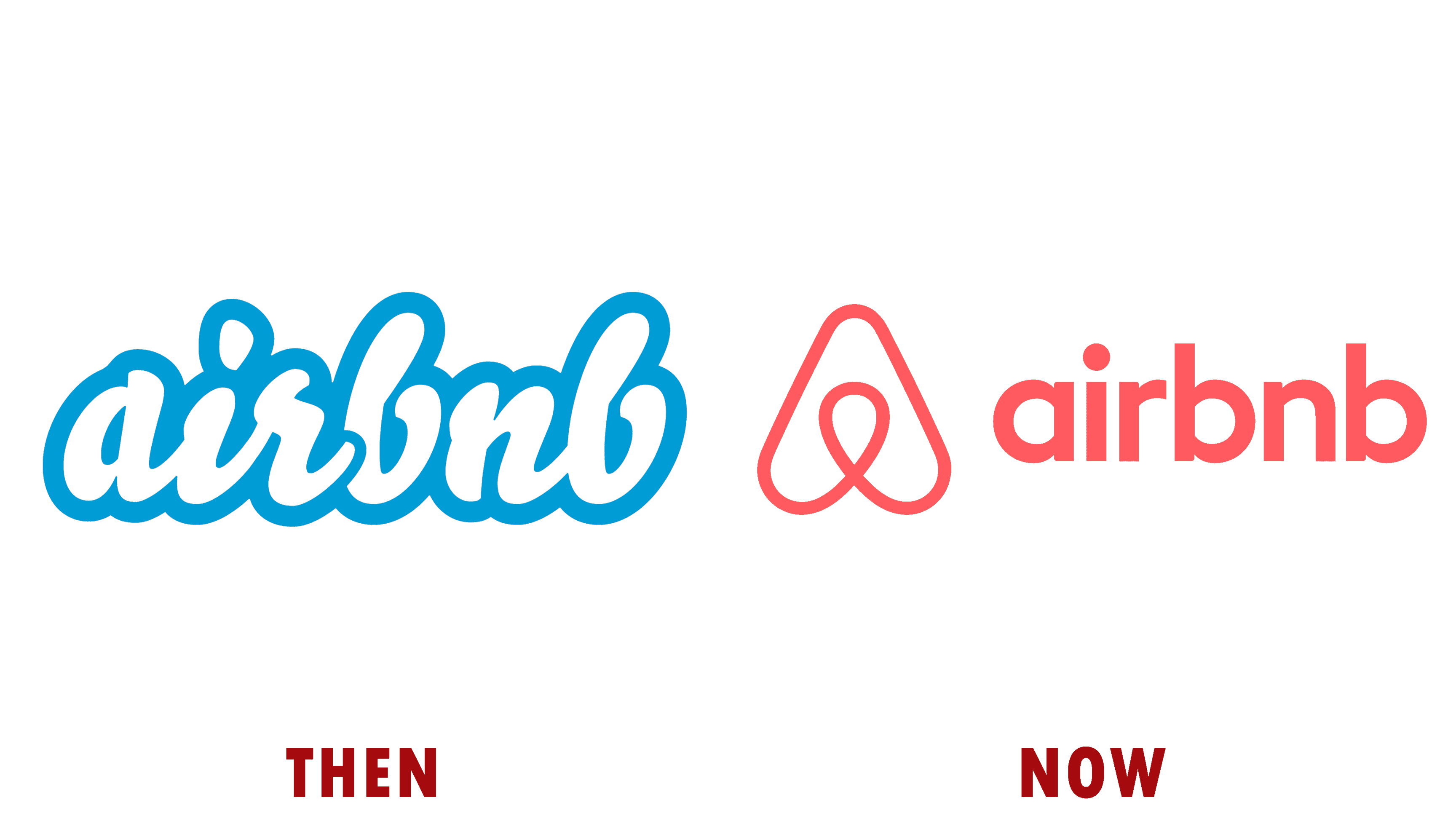
The above image is a visual representation of the Airbnb Logo then and now.
Airbnb Logo then and now: Airbnb’s logo evolution reflects its journey from a modest startup to a global hospitality brand. The original “AirBed & Breakfast” logo featured playful, bubbly fonts and bright colors, emphasizing a casual, friendly approach to travel. In 2014, the company introduced the “Bélo” logoa stylized heart-shaped “A” symbolizing “belonging” . This rebrand marked a shift towards a more mature and meaningful identity, aligning with Airbnb’s mission to foster a sense of community and connection.?

